
2018 Best Travel Websites Built Using DIVI
Travel is a luxury that not everyone can afford, but thanks to these DIVI built websites anyone can experience traveling even in the comfort of their own homes. When it comes to DIVI themed travel sites, these can get you immerse into the site as if you’re actually traveling.
These sites are good examples of what this blog is about, shall we begin?
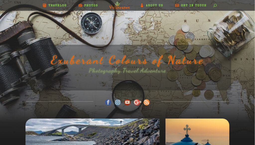
Vivid Scapes
The way the font of the title and subtitle has a shadow effect to it is cool. The banner background is a nice touch, not straying from the concept of the website itself. The way the images on the homepage are arranged is well proportioned, using the golden ratio makes it more appealing to the eyes. The map at the bottom of the home page is unique, it isn’t like the ordinary maps you see on websites — no. This one has images and information for the users to see instantly, which is another nice touch to this website. I also like the “Travelog” page, the images are magnificent and breathtaking, and it feels as though you’re actually there with them.
So, if anyone ever needs choices where to go for their next vacation, this is a good website to look for those perfect destinations.
Vivid Scapes
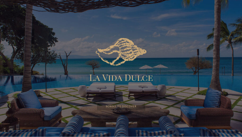
La Vida Dulce’s logo is attractive, it presents where their villa is. The slider banner is also an amazing feature, at first it’s a bit dark but gradually brightens. Another good feature is the navigation bar. It isn’t visible on the banner but it will pop up when the users scroll down the page. Using parallax to divide the sections is on some pages is a nice touch, they still show sceneries from every angle of the estate and from every room to give them a tour somehow while explaining their offers, they also show some images of what other things visitors can do on the whole island.
The website makes you feel like you’re actually in the villa taking a vacation away from the busy life and hectic city some may be living in.
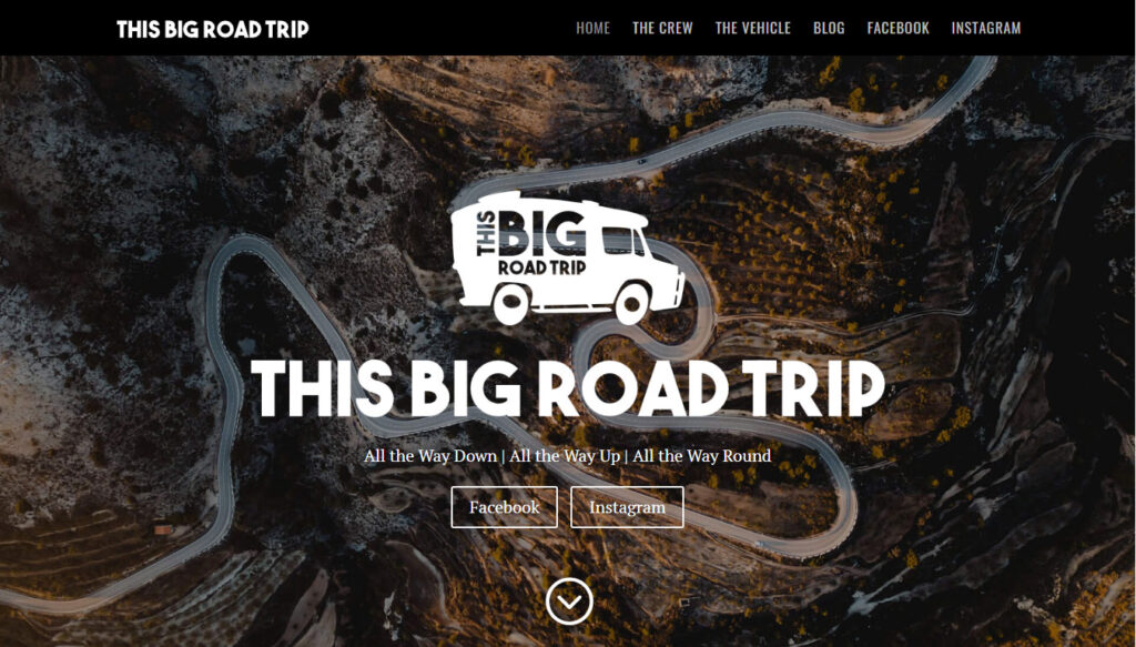
This Big Roadtrip
It’s good that they placed the social media icons on the side so it would be more noticeable than putting it just at the bottom of the site on every page except the homepage. The blurbs have good animations, just a bit more adjusting so the texts can be read and it will be awesome. The colors are relaxing to the eyes, it’s minimal and elegant at the same time. The information of what they use in travelling is also useful, it isn’t like those typical long lists you just scroll down to read. Here, they used accordions to list the equipments they used. I think they used the accordion just so that the page won’t get too long and boring for the users.
This site is always able to keep the user’s attention focus on the trip they plan on having.
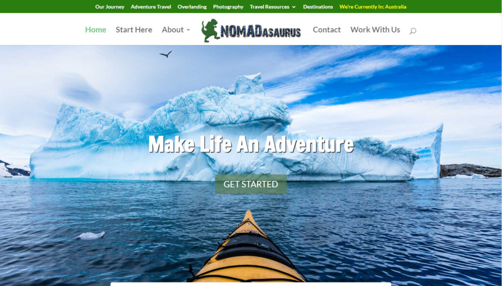
Nomadasaurus
It has two menu bars, one for the basic information and the other for the more detailed things the site offers. I also like the logo, it really captures the name of the site – a dinosaur with a backpack. Although the background image of the banner is bright and they used white font color for the text, it’s still readable thanks to the text shadow. The blog post is placed nicely just a section after the banner for everyone to immediately see just like at https://pacificdreamscapes.com/. It is always a good thing to let users see the blogs so they know if they want this site more. I like the way they separate their topics with a parallax.
Nomadasaurus
The images are just dark enough to let the white text be read properly. The banner’s text is awesome as well, the letters made me think it was already with the image but it was actually a font style. The social media icon hovers are amazing as well, instead of changing color or being highlighted, they face the right just a bit. The hover animation on the “Start Exploring” section is another thing I want to point out, it feels like looking through glass. The footer has a cool design, too, with its paintbrush stroke and the “Great Wall” background above it has a historic feel to it.
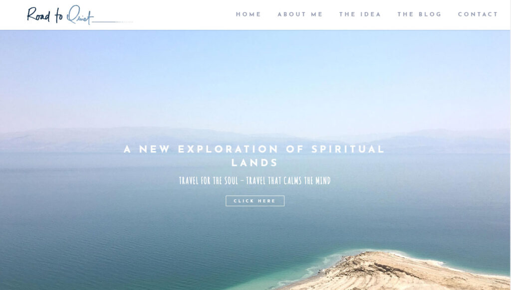
Road to Quiet
The two text fonts really compliment each other, the background images are scenic and everything is relaxing to the eyes. But there is an issue with this site, the h1 tag is used too much. Search engines might get confused, then again the site does look neat and organized.
The logo is great, it’s written in cursive letters but it’s still readable. The gallery images in the home page have low chroma hues which makes it bright, but not too bright, and pleasing to the eyes.
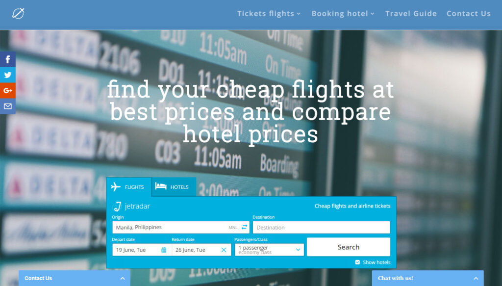
Cheap Travel Booking
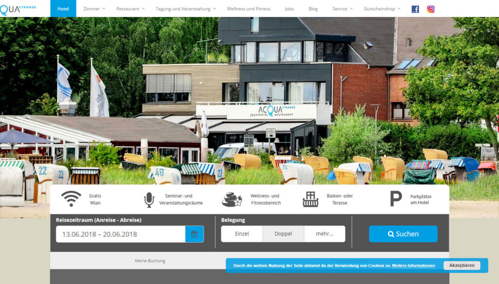
Acquastrande
I like the way this was made with the colors of the restaurant in the image in mind. It’s also useful that they placed the search options after the banner and the way they used colors for their calendar on what dates are available and bookable.
Acquastrande
I like the way this was made with the colors of the restaurant in the image in mind. It’s also useful that they placed the search options after the banner and the way they used colors for their calendar on what dates are available and bookable.
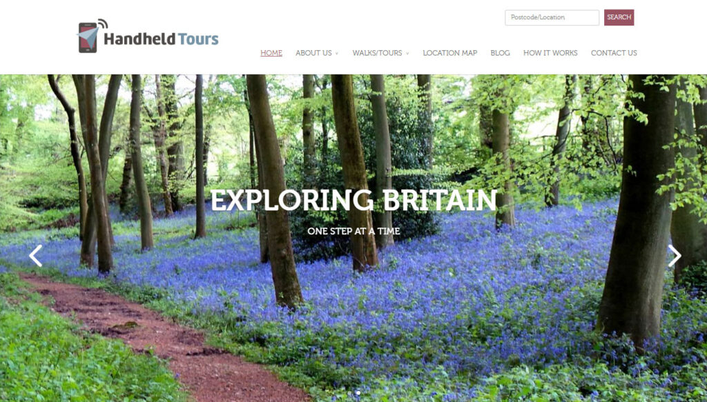
Handheld Tours
I like the way this was made with the colors of the restaurant in the image in mind. It’s also useful that they placed the search options after the banner and the way they used colors for their calendar on what dates are available and bookable.
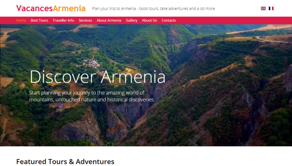
Vacances Armenia
The site has a simple navigation bar which is already small but still shrinks when scrolling down for a better view of the site. The banner shows amazing views of the mountains and hills, showing off the tourist spots they can offer.